The following is the final El HEMA logo with its 3 standard sizes.
The rest is exploration of the interior signage of the Hema shops.
Arabising Hema
The metamorphosis of the contemporary Hema to an Arabic modern El HEMA
Taking a step further in developing its brand, Hema seems to be smoothly introducing its new simplified logo on the products.
The Arabic version of the new logo was designed based on the primary El HEMA version, originally designed by Tarek Atrissi.
The difference is minor but gives the shop a more updated image. The logotype drops the blue underline and lays down on a bright square with soft round edges.


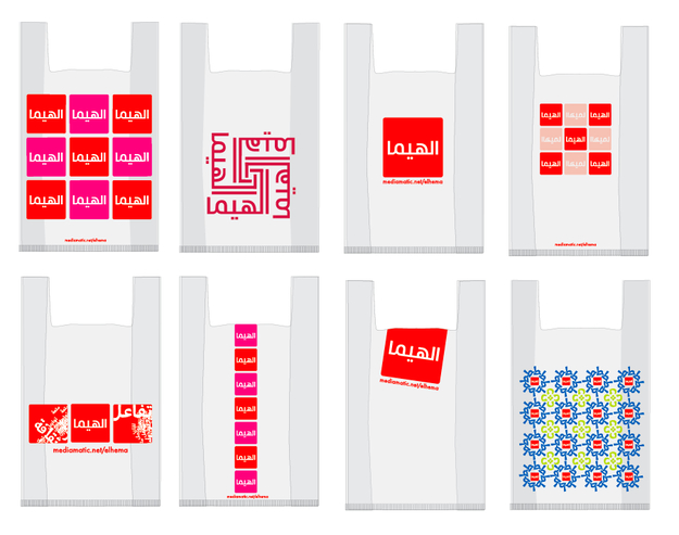
El HEMA bag - Mediamatic designed a El HEMA shopping bag to carry your El HEMA goods.


Signs in the El HEMA shop. - De aanduidingsborden in de winkel. Ontworpen door Waël Morcos.


